process
poetics
This event was all about poetry and the team wanted a cool, creative, handmade feel. I chose bright colors, a typewriter-esque font, and bold tilted geometric shapes. We wanted to make sure that it didn't feel dull since that feeling is commonly associated with poetry. These two graphics were for the TEDxOhioStateUniversity's social media to promote the event.
between the lines
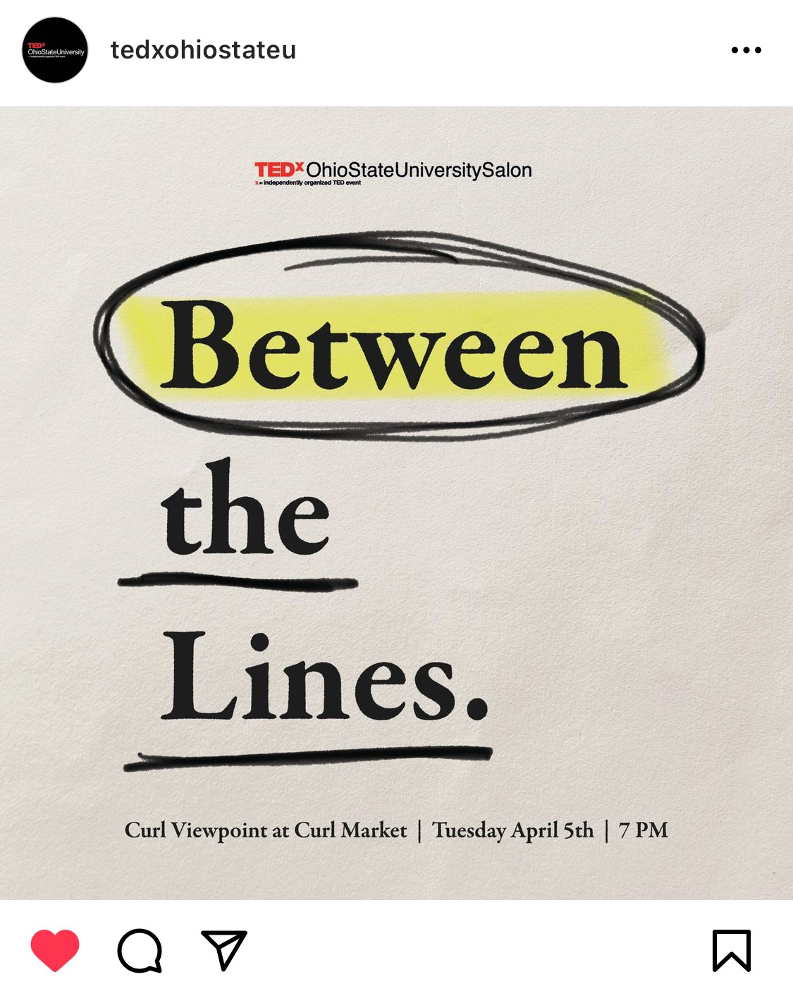
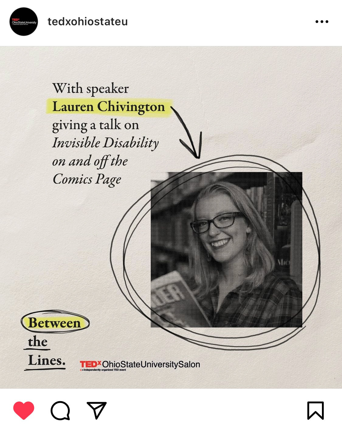
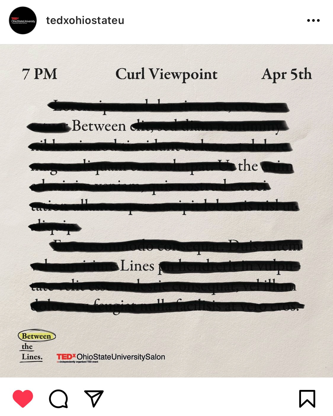
Between the Lines was an event about the intersectionality of literature and disability. The team wanted a book inspired brand identity, so I took that and ran with it. I used the Garamond typeface (commonly used in books), a soft paper texture, and digital annotations to make it feel cozy yet exciting and different. Here are some social media graphics I made to promote the event!
bloom
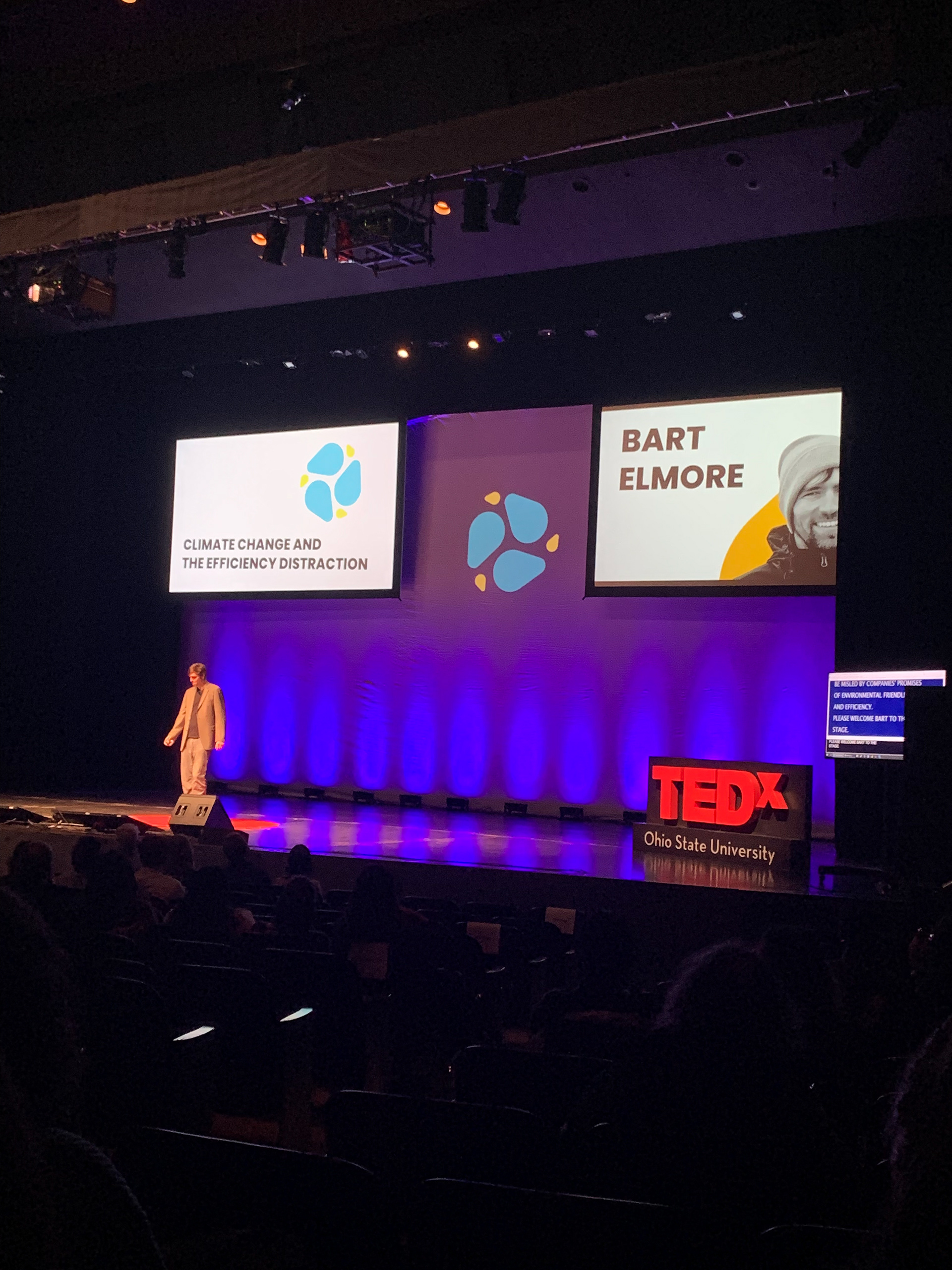
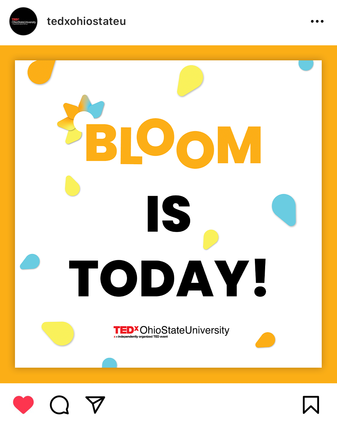
BLOOM was TEDxOhioStateUniversity's main event in February of 2022. I was in charge of the stage projections that introduced each speaker. The brand identity (created by other members of the design team) centered on petal shapes. I decided to give them a floaty/flowy feel as if they were blowing on screen from right to left. I also animated each of the speakers' little icons that represented their TED talks.
