process
writing | storyboarding
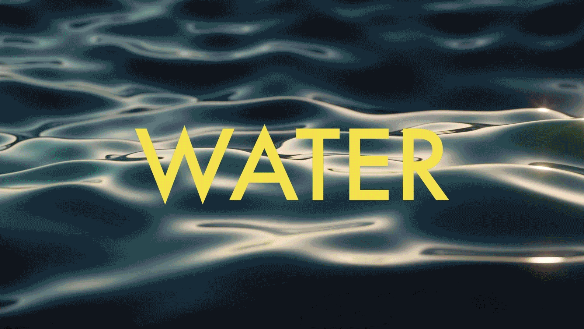
"Currents" was a pretty abstract theme for an event about TED talks, so my video needed to define what it meant so the audience understood what they were getting into. I'm big on organization and things being clear, so this was a really fun project to start from scratch story wise. Visually, I wanted it to be dynamic yet simple enough so the audience didn't get overwhelmed. I achieved this with lot's of text, big bold visuals, and meaningful movements.
motion design
For this video, I really wanted to take advantage of the available projection space. There are a few times where the middle projector overlaps with the smaller two and those two screens show different visuals but still act as one. It was a little complex, so it didn't go completely to plan on event day, but it was still definitely a success. In the mock-up video it demonstrates the correct timing. From top to bottom: the final videos that played on stage, a mock up of the three videos together, the left screen, and the right screen.
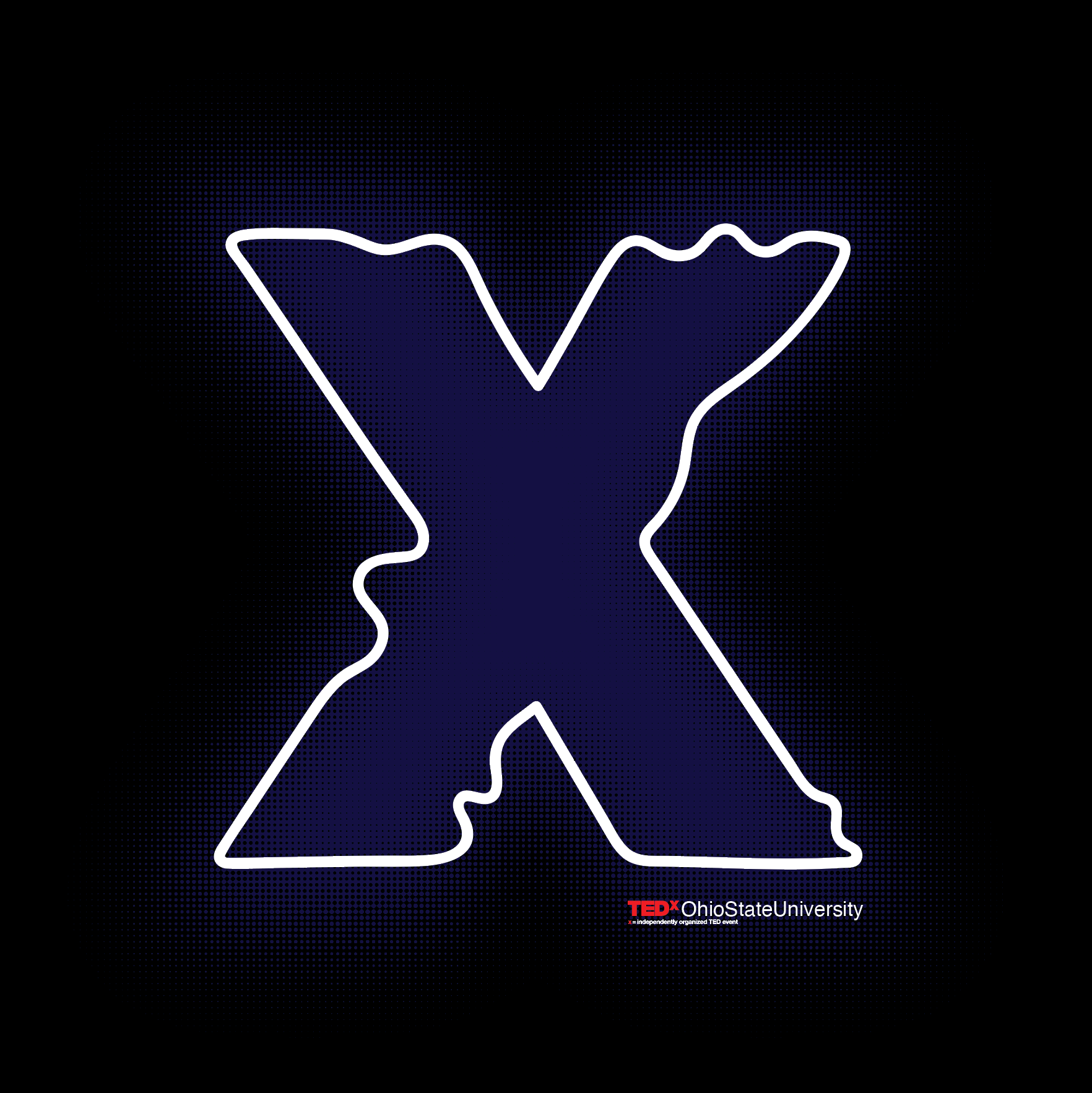
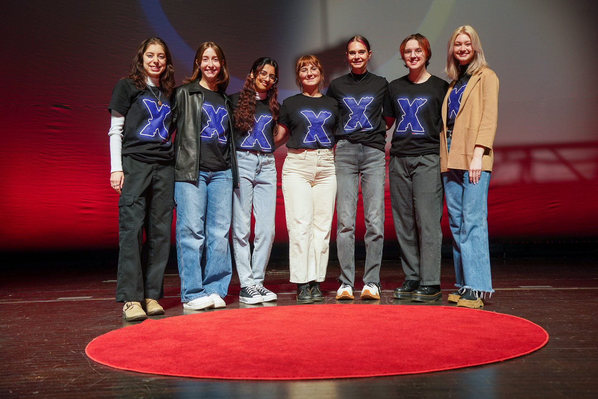
bonus shirt design
I also had the pleasure of designing the shirts that all TEDxOhioStateUniversity's members wore on event day. We keep it simple every year with some variation of the X. I incorporated the wavy line that is seen throughout Currents' brand identity. I also wanted to make it look like it was glowing. To achieve this I used a dark color and feathered it around the edges with a subtle half-tone dot effect to make sure it held up in the printing process.